
Microsoft Power BI is a comprehensive business analytics service that transforms raw data into interactive visualizations and coherent insights. It allows users to connect to hundreds of data sources, simplify data modeling, and create real-time dashboards. With its intuitive interface, anyone can generate meaningful reports to drive business decisions.
Why it’s perfect for Data Analytics
Power BI is perfect for data analytics because it seamlessly combines powerful data preparation, visual analytics, and interactive reporting in a single, cost-effective platform. Its ability to handle massive datasets in real-time, coupled with its deep integration with the Microsoft ecosystem (Excel, Azure, SQL Server), makes it accessible for beginners yet robust enough for advanced data scientists.
The advantages of Power BI?
Power BI is already established as a business analytics tool in many companies and organizations. This is due, among other things, to the numerous advantages that its use brings:
- User-Friendly Interface: Power BI has a user-friendly interface, and it is easy to use for both beginners and experts. It provides drag-and-drop functionalities, which means that you don’t need to know any coding or programming to create complex reports.
- Integration with other Microsoft Products: It integrates well with other Microsoft products such as Excel, SharePoint, and Teams. This integration allows users to import data from different sources easily and to work with familiar tools that they may already know. In addition, the interface is already familiar to many users of other Microsoft Office products, which means that they can quickly become familiar with it.
- Real-Time Collaboration: The Microsoft tools allow users to work together in real-time, which means that teams can work on the same data simultaneously. It is ideal for collaboration as it supports sharing and publishing of dashboards.
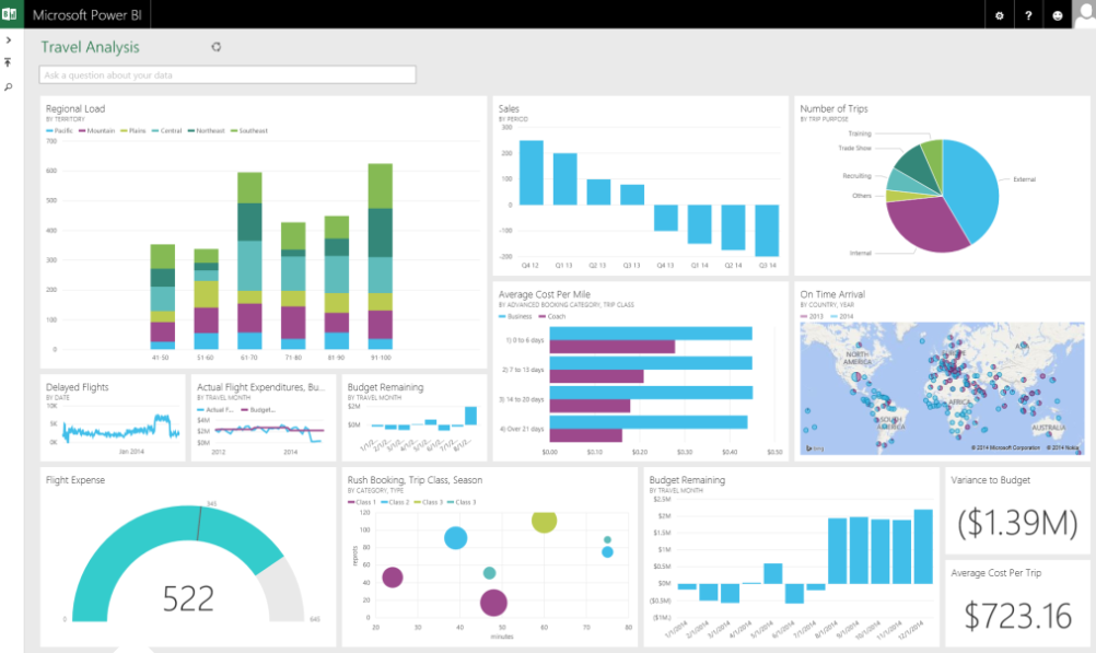
- Custom Visuals: There is a wide range of custom visuals, which means that users can customize their reports and dashboards to suit their needs. Custom visuals include charts, maps, and other graphical representations that can help users better understand their data.
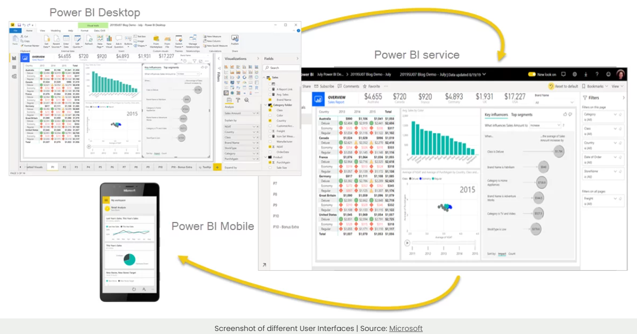
- Mobile-Friendly: Power BI is designed to work on mobile devices, and users can access their data anytime. This feature makes it easier for teams to work remotely or on the go.
Studies and user feedback consistently show that Power BI improves productivity at work by reducing the time spent on manual reporting by up to 90%, allowing professionals to focus on analysis rather than data gathering.
At PathWay2050, we offer a comprehensive course designed to take you from raw data to polished, interactive visuals by showing you how to pull information from Excel and other sources into a unified dashboard, we illustrate exactly how Power BI can make your life easier at work.
This course is incredibly useful for Data Analysts, Project Planners & Managers, Marketing & Sales Managers, Energy Managers, and anyone who regularly works with data and seeks faster, clearer insights.
In a One-day online/in-person course (8 hours) we focus on the critical first steps of data analytics, processing, transforming, and cleaning your data using Power Query, a powerful Microsoft tool. From there, we guide you in building meaningful and attractive visuals in Power BI Desktop, using your own data or the official Microsoft “Dashboard in a Day” tutorials to demonstrate real-world application lodge your expression of interest and ask for a quote by submissting the form below…